和歌山県の首都圏アンテナショップ「わかやま紀州館」のリニューアルの計画である。和歌山ならではの商品が並び、新たにイートインコーナーを設ける店舗として設計した。
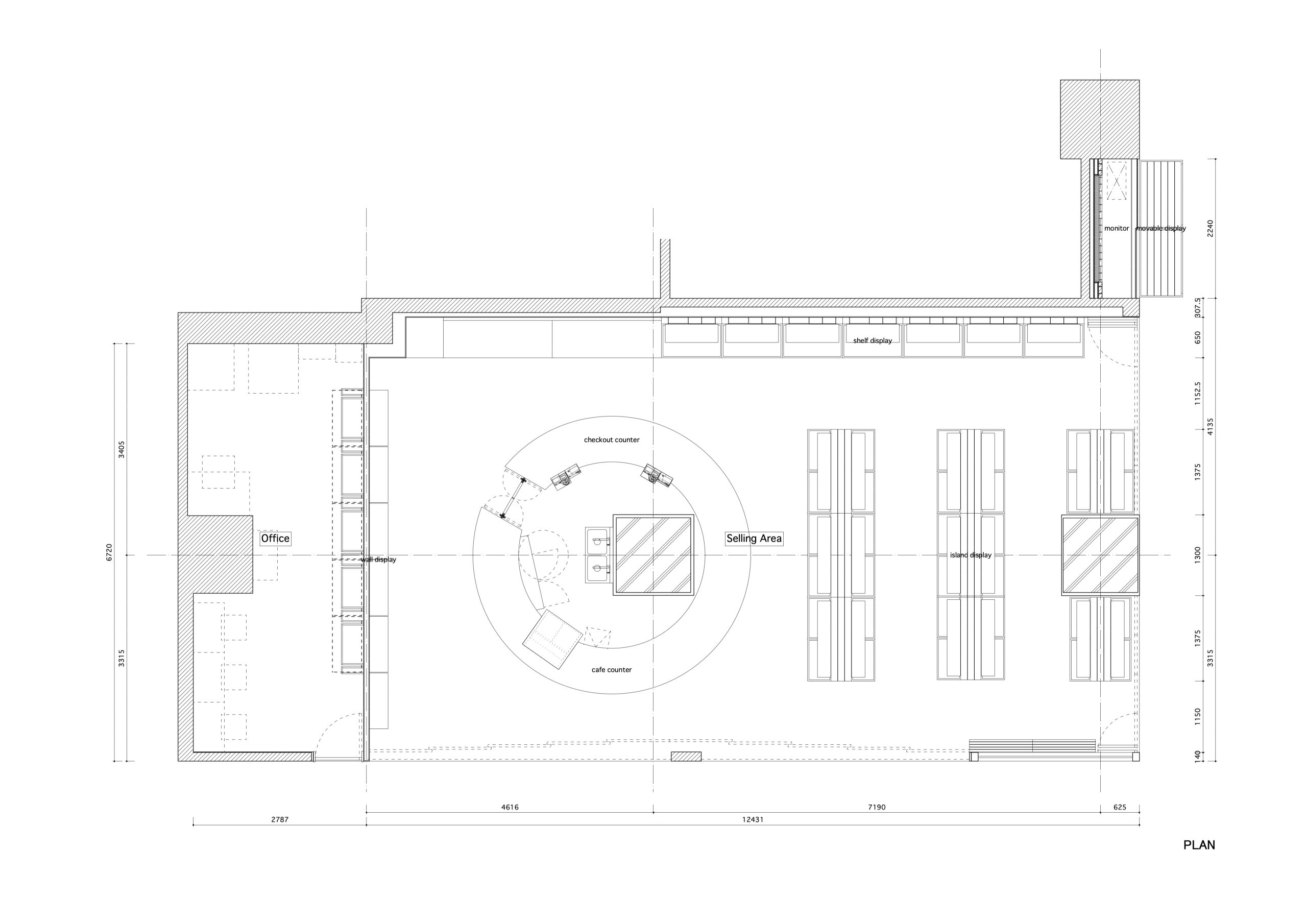
計画店舗は有楽町駅前の東京交通会館の地下1階の一角である。
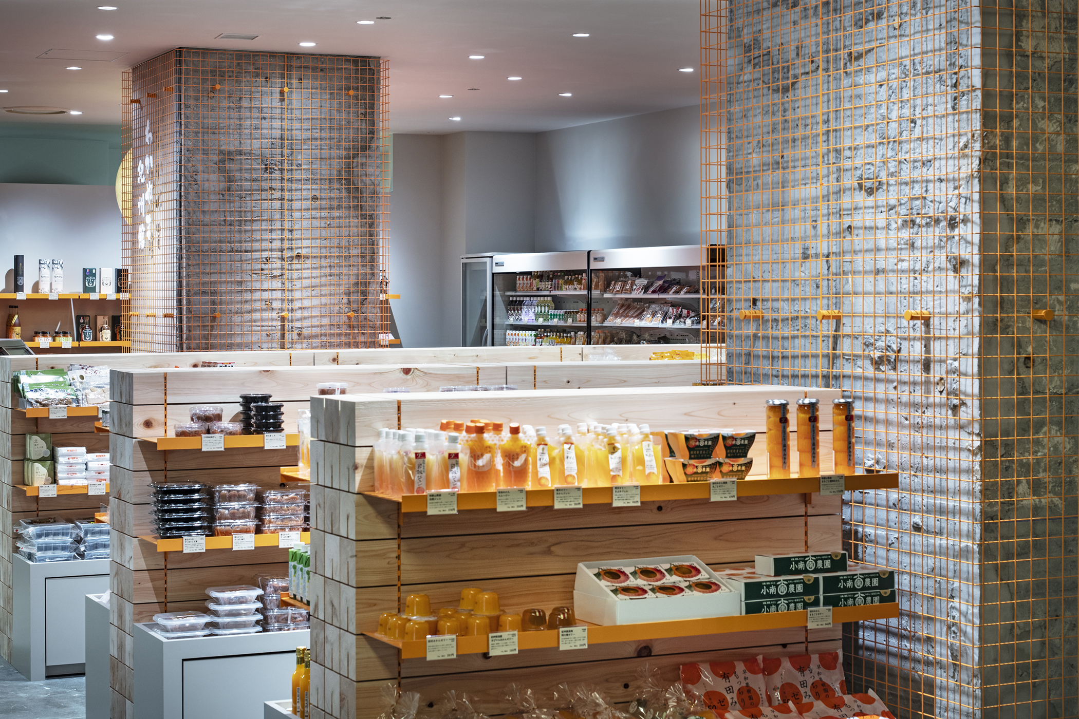
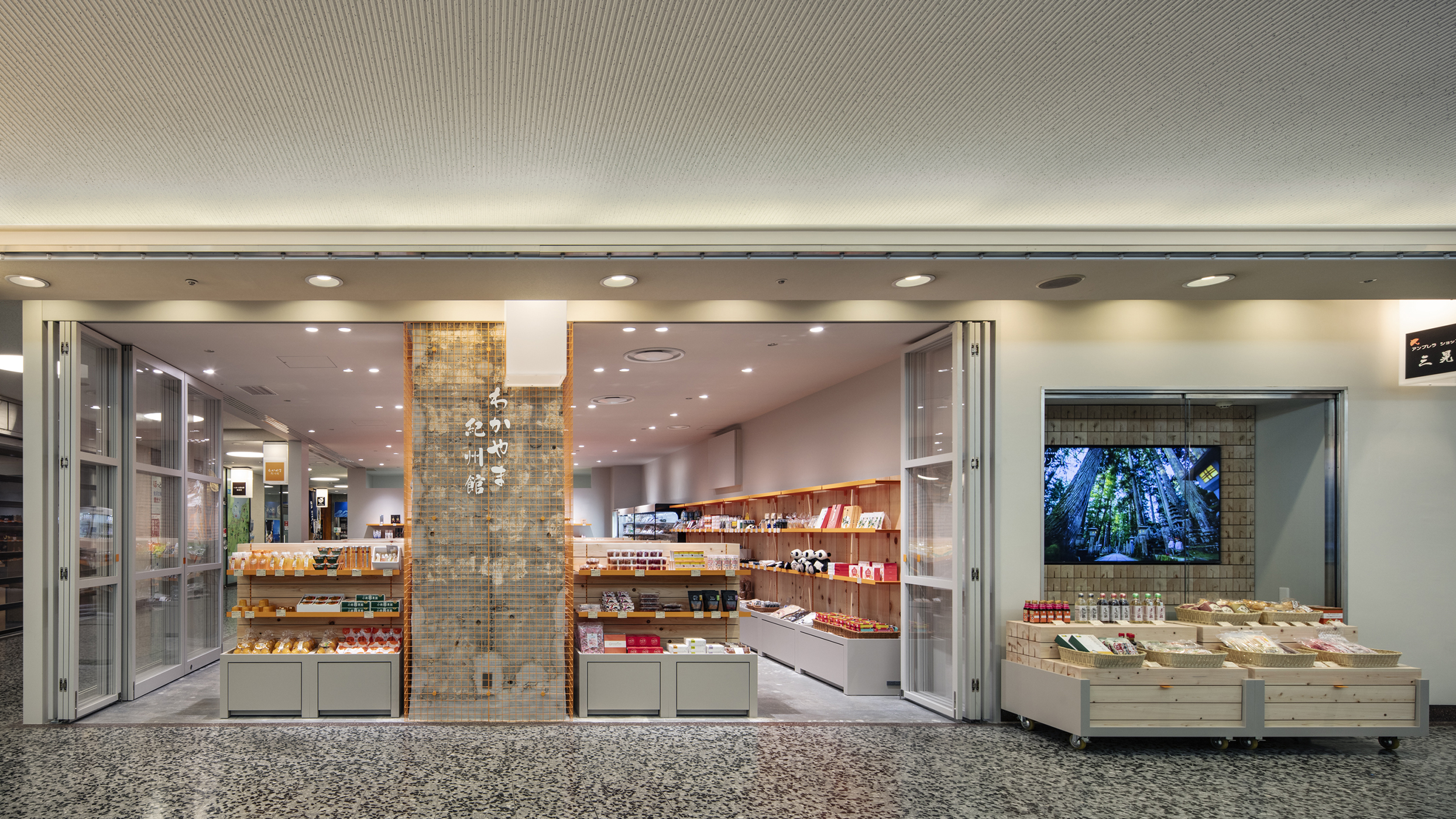
この施設の低層部には全国各地のアンテナショップが立ち並び、通行人の目を引くために様々な仕上げや看板で装飾が施されている。また、物産館という店舗形態は、幅広い商品を生産者から個別に仕入れるため、商品の品目やパッケージデザインが統一されておらず、どの店舗も大量の視覚情報で溢れている。
そこで、本計画では、多種多様な商品に統一感を与える背景をつくり、かつ通行人を店内に引き込むような要素を兼ね備えた店舗とすることを目指した。その具体的な方法は次の3つである。
1:ローカルマテリアルと触覚性
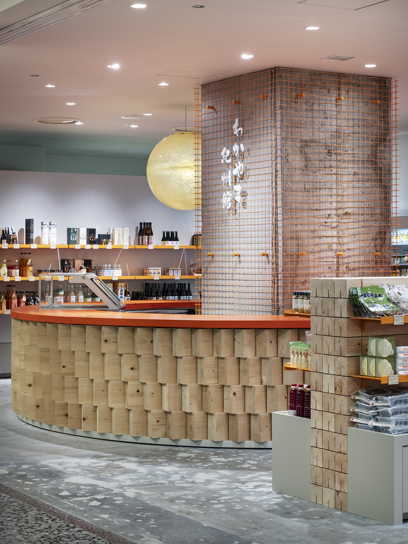
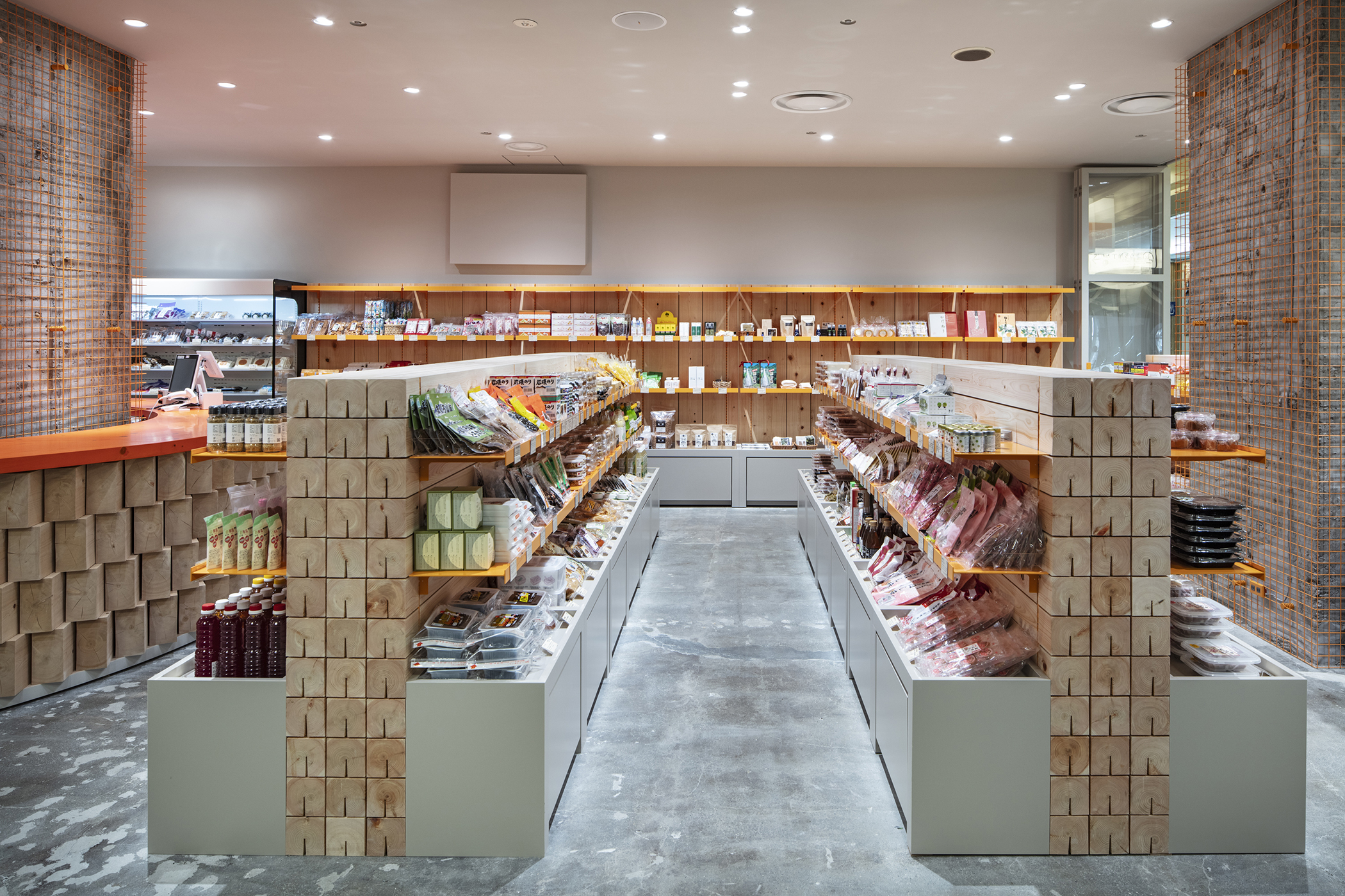
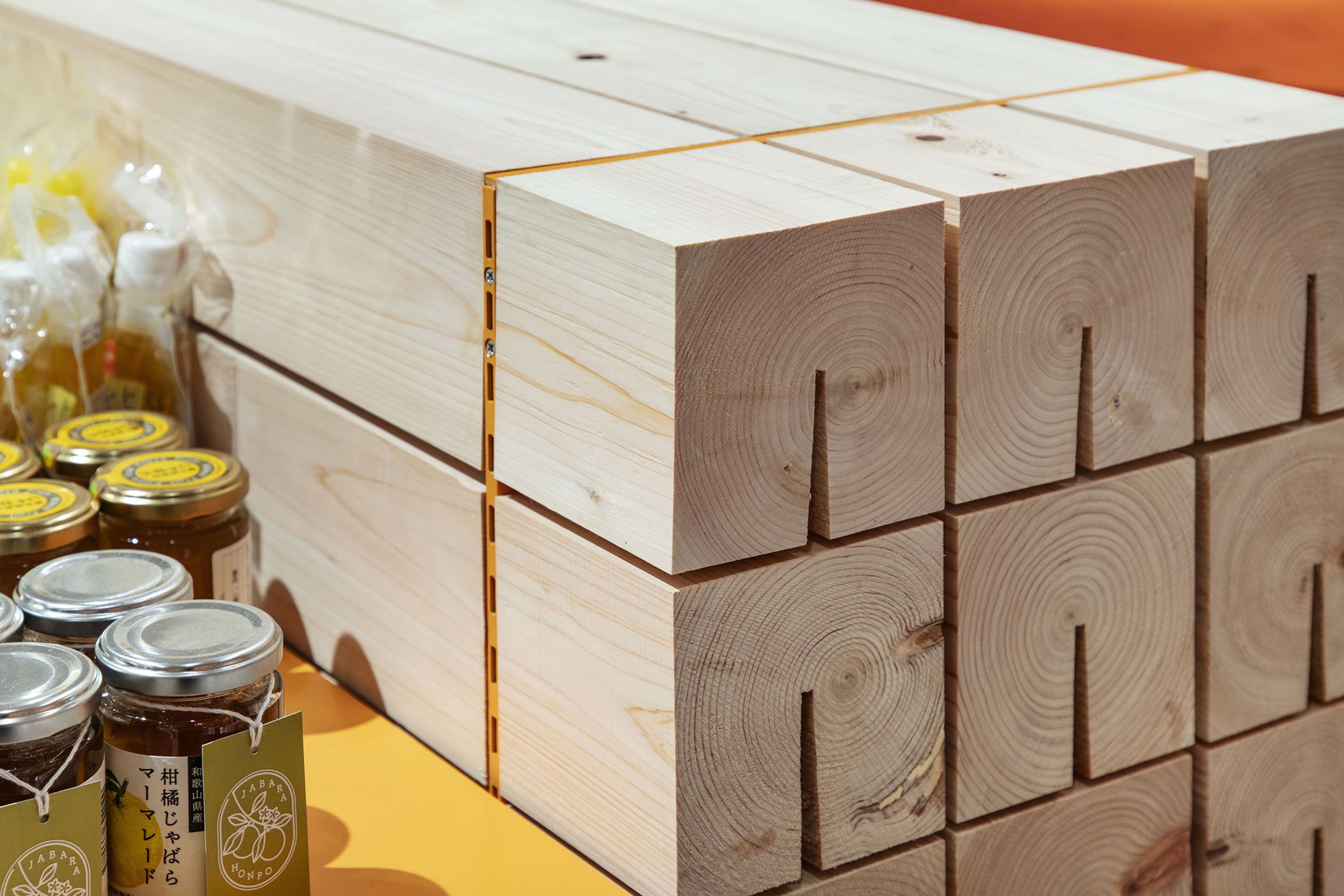
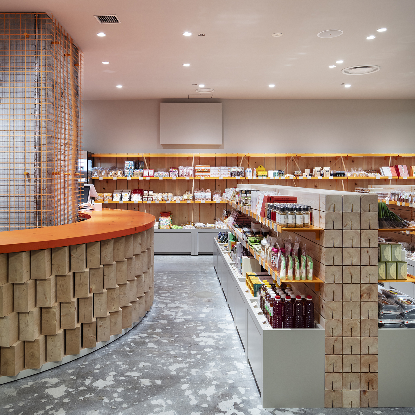
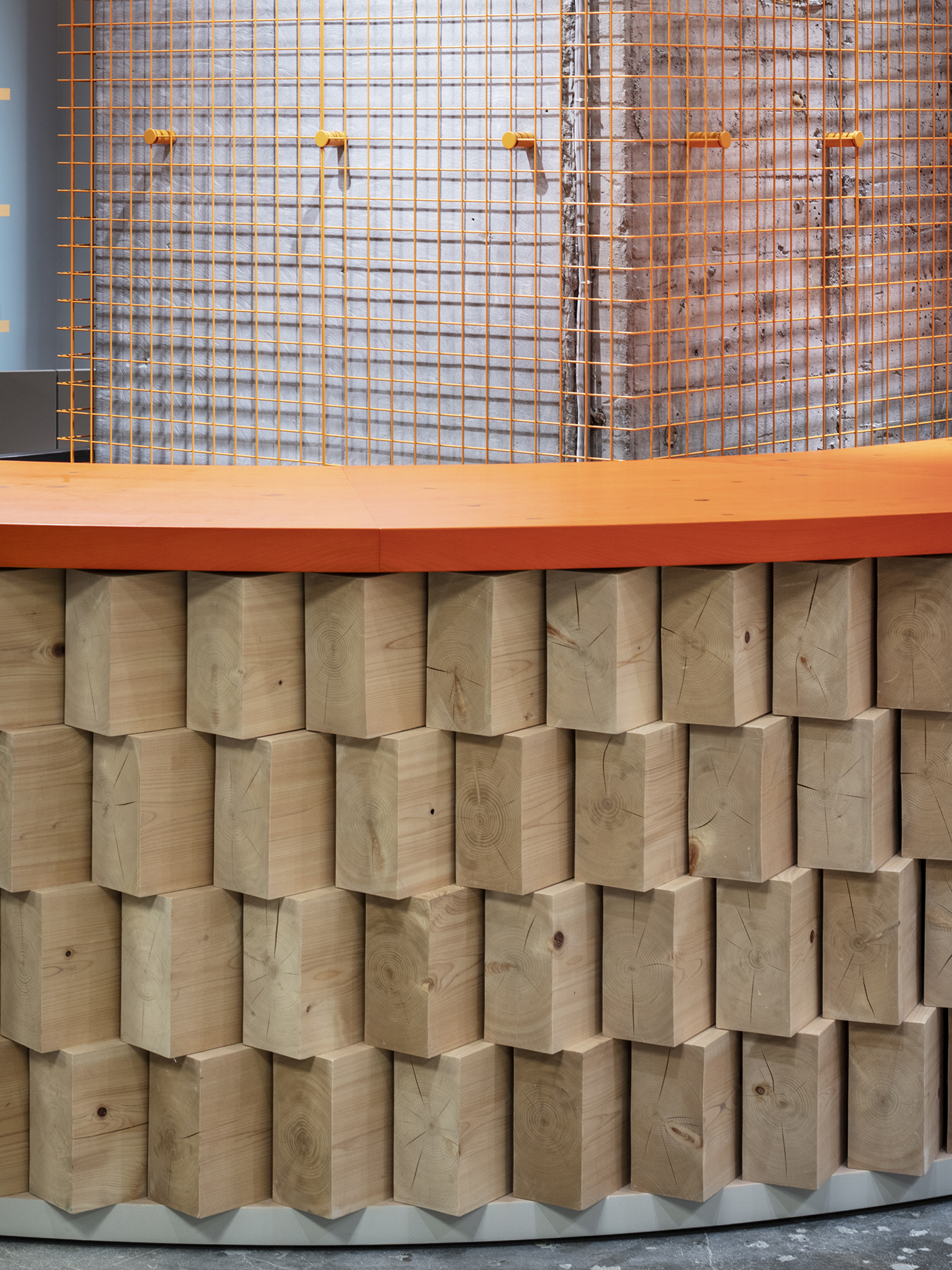
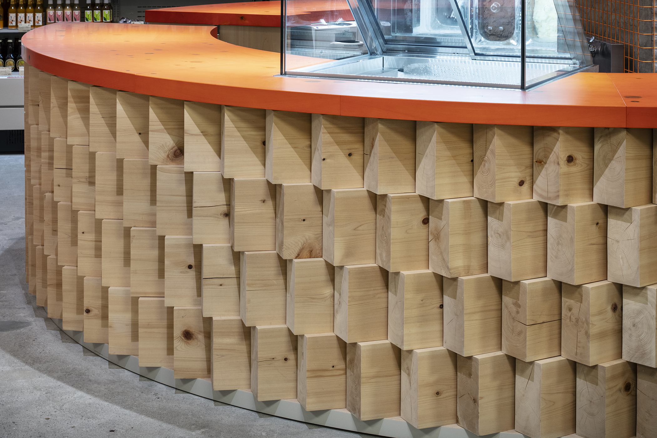
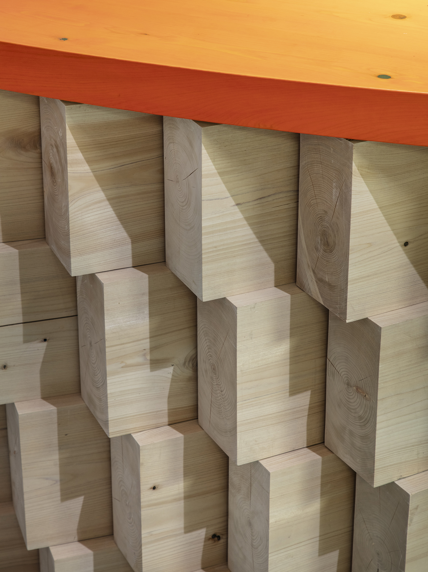
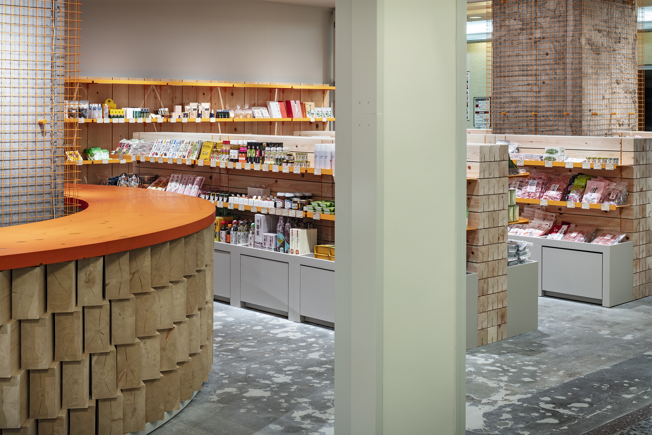
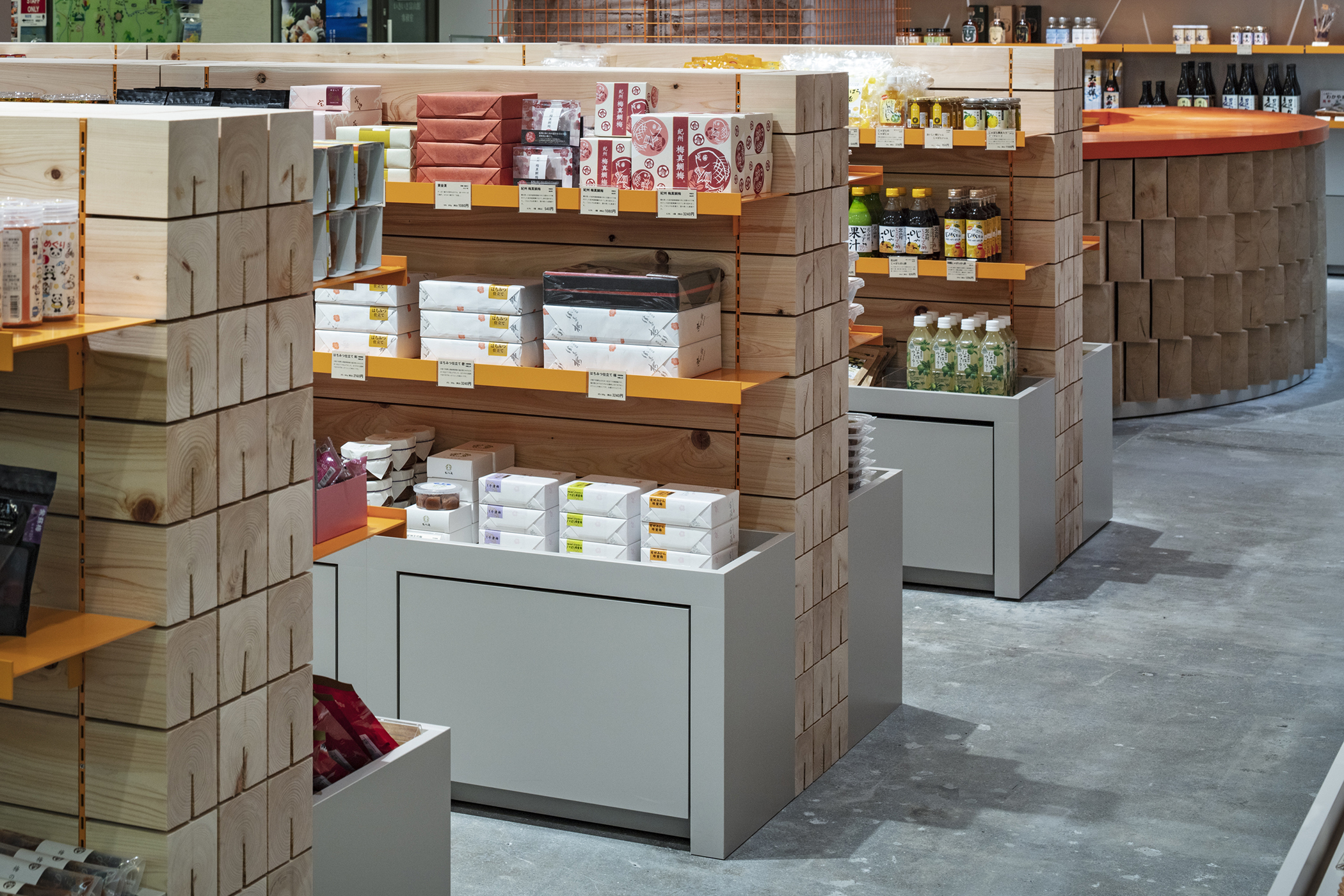
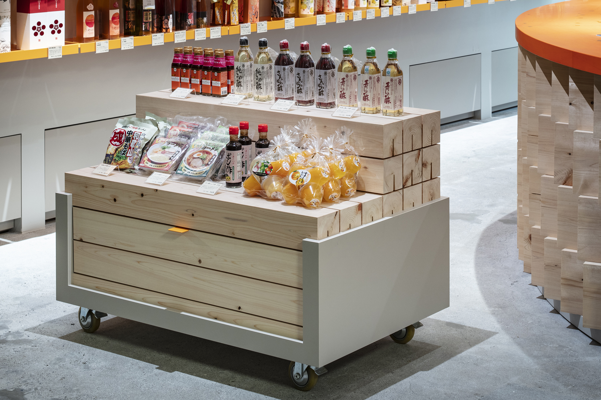
設計要件として特に重要視されたのは和歌山県の豊富な山林が育んだ紀州材を使用することであった。紀州材は他の産地の木材と比較して、色合いや目合いが良く、素直で狂いが少ないのが特徴である。まるで山から切り出された木々が製材所に並んでいるかのように、シンプルに並べ、積み重ねることで材料そのものの美しさをストレートに伝えることを意識した。メディアやインターネットの発展と共に視覚性優位が過剰になった現代において、紀州材のヒノキが持つ豊かな香りは臭覚を刺激し、店舗前を行き交う人々を店内へと誘い込む。
2:色ーツヤと誘目性
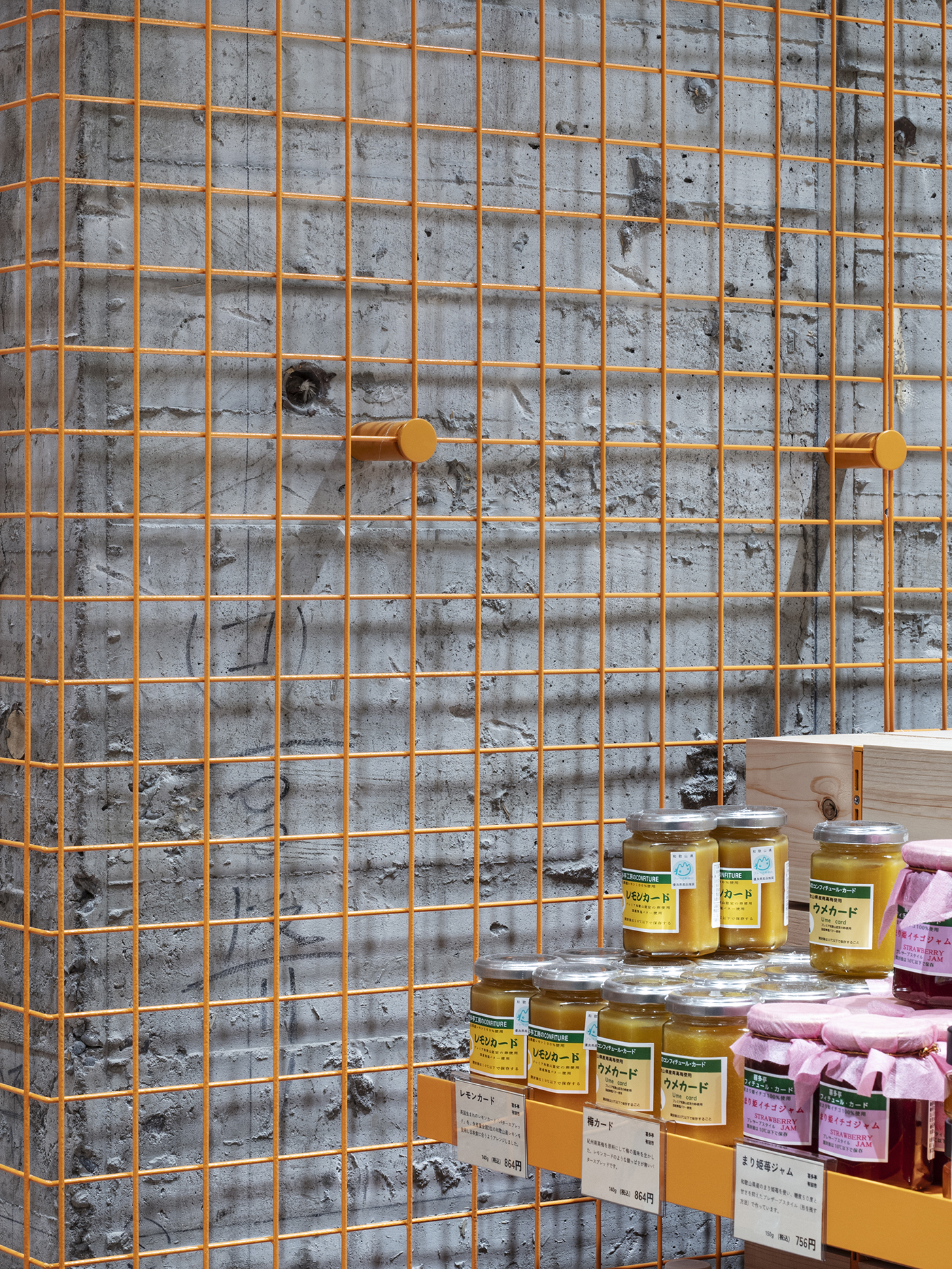
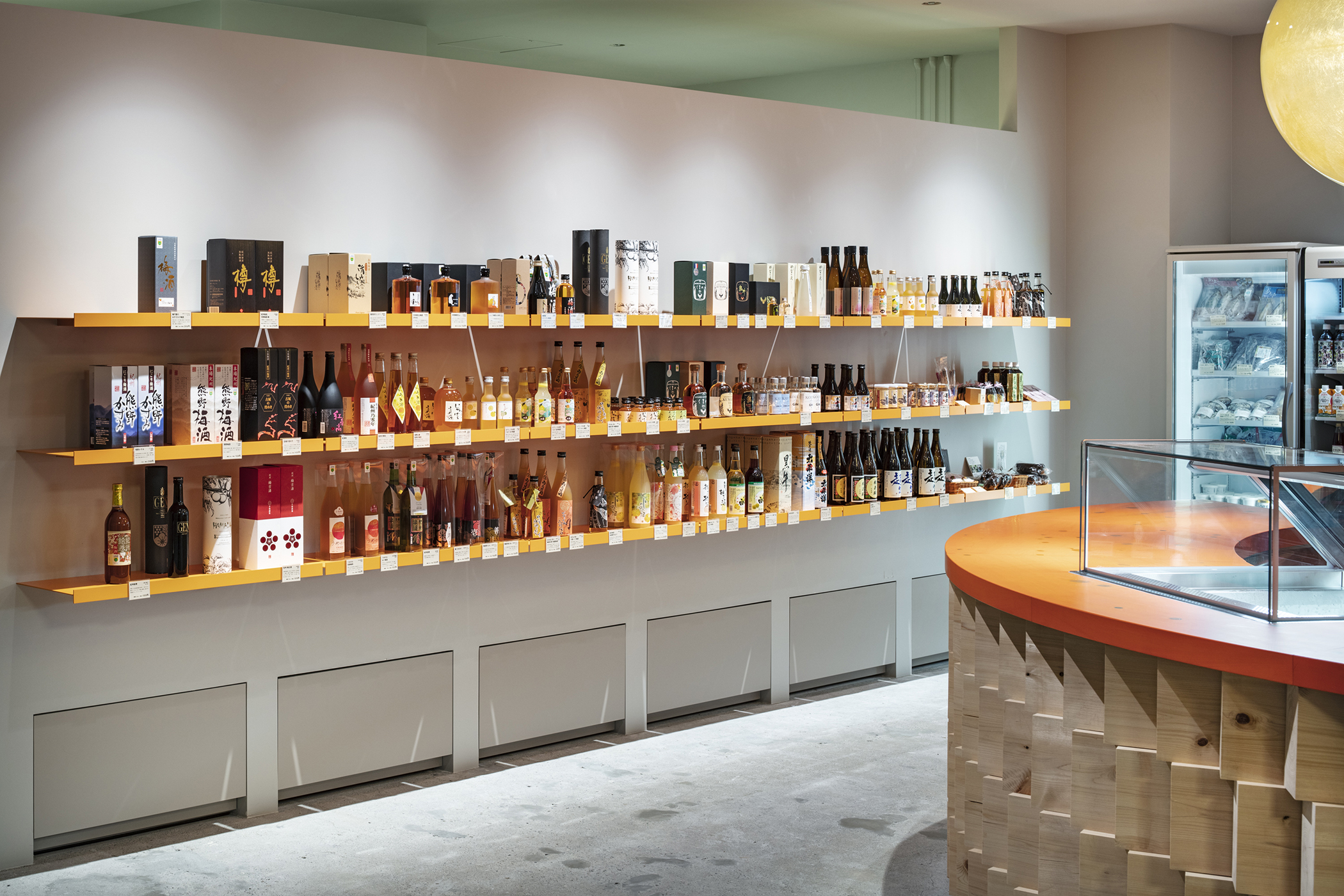
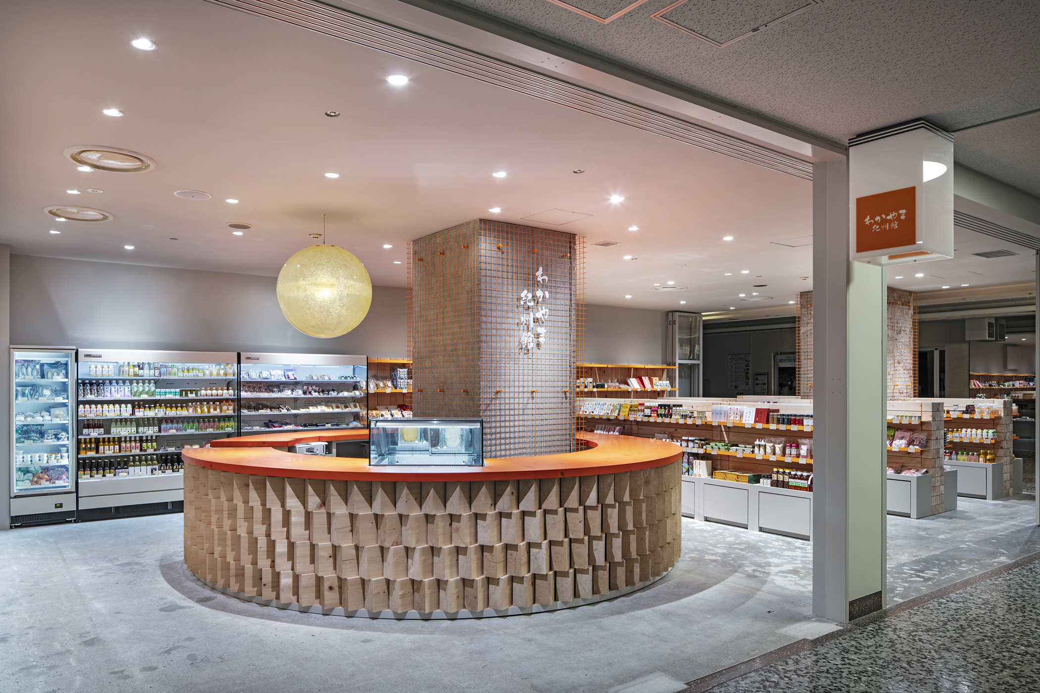
取り扱う商品は和歌山県自慢の商品であるが、それぞれのパッケージの形、色やツヤは様々である。この商品の集積の印象が統一して魅力的にお客さんに伝わるように、背景に橙色を用いてコントロールをした。また、店舗スペース内の太いコンクリート柱には、橙色に塗装したメッシュで包むことによって目に留まりやすいファサードをつくった。
3:シンボルと回遊性
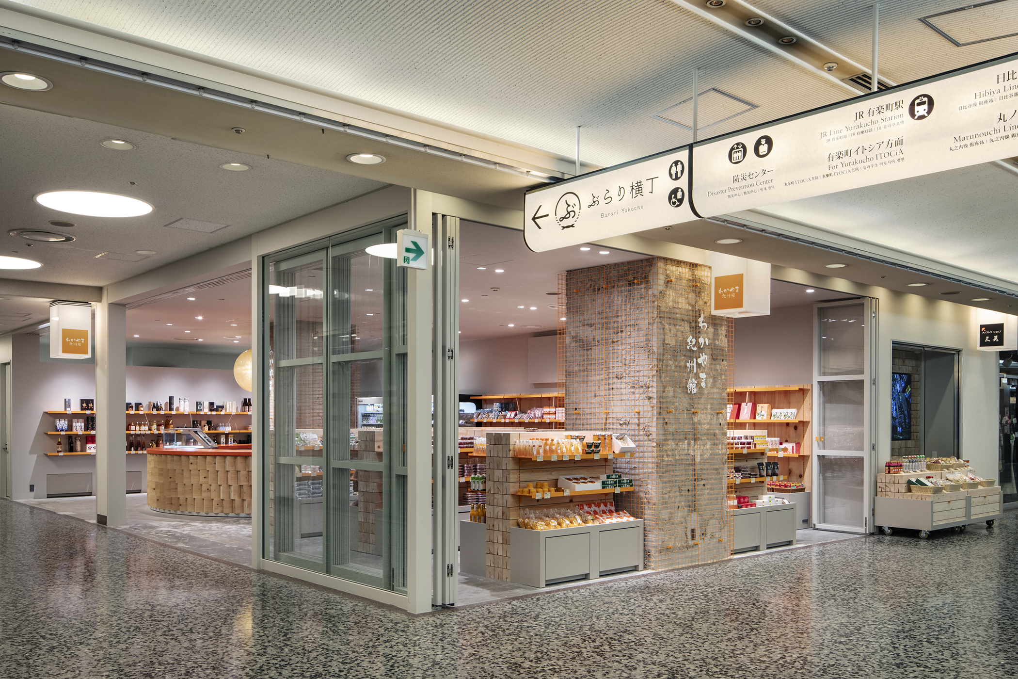
通路に向かって大きく開き、目線の高さに抜けをつくる事で店舗全体を見渡せ、奥まで進みたくなるように誘発するように配置計画をした。レジ機能と飲食スペースを担う円形カウンターは店舗の中心にある柱を囲むかたちで配置することで、商品棚の反復で単調になりがちな物販店舗に回遊性を生み出し、お客さんを惹きつける店舗のシンボルとなった。
この店舗が和歌山の自然が生み出した豊かな農作物や加工品を自分の手で触り、香りを嗅ぎ、デジタル化されていないリアルな豊かさを体感できる場所となる事を期待する。
(中川宏文 + 山本稜)
——
This is a renovation project of the Wakayama Kishukan, a place where local specialties from Wakayama Prefecture are sold to the people in the Tokyo Metropolitan area to promote Wakayama. For the redesigning of the store, an eating area has been added.
The store is located in the basement of a local landmark building in front of Yurakucho Station.
The lower level of this facility is lined with stores selling local specialties from all over Japan. Every storefront is decorated with a variety of designs and signages to attract the attention of visitors. In addition, because stores of this type procure wide-ranging products directly from different producers, product types and package designs are not standardized and, as a result, all storefronts are inundated with a large amount of visual information.
With this background, we aimed to provide a sense of unity for a wide variety of products and add elements to attract passersby into the store. The following are three specific ways to achieve this:
1: Local material and Tactility
A particularly important design requirement was the use of Kishu wood, a product of the abundant forests of Wakayama Prefecture. Kishu wood has a better color and texture and is more consistent in quality than woods from other regions. We were conscious of conveying the beauty of the material itself by simply arranging and stacking them as if they were cut from the mountains and lined up in a sawmill. In today’s age of excessive visual dominance with the development of media and the Internet, the rich scent of Kishu cypress will stimulate the sense of smell of people passing in front of the store and draw them into the store.
2: Color: Luster and Noticeability
The products sold in the store are the pride of Wakayama Prefecture and their shape, color, and luster of each package vary. In order to create a uniform impression of these products collectively and in an attractive manner on customers, we used orange as a background color to provide the sense of unity. The thick concrete pillars in the store are also wrapped in orange-painted mesh to create an eye-catching facade.
3: Symbol and Circulation
The storefront widely opens out towards the corridor and creates an unobstructed line of sight, providing visitors a panoramic view of the store and inviting them to come inside. A circular counter that serves as a cash register and an eating area is placed around a pillar in the center of the store. This layout encourages visitors to circulate between different sections in an otherwise monotonous retail space with rows of product shelves. It is the symbol of the store that attracts visitors.
We hope this store will become a place where visitors can touch and smell the agricultural products and processed goods given by the nature of Wakayama Prefecture and experience the real richness detached from digitalization.
(Hirofumi Nakagawa + Ryo Yamamoto)